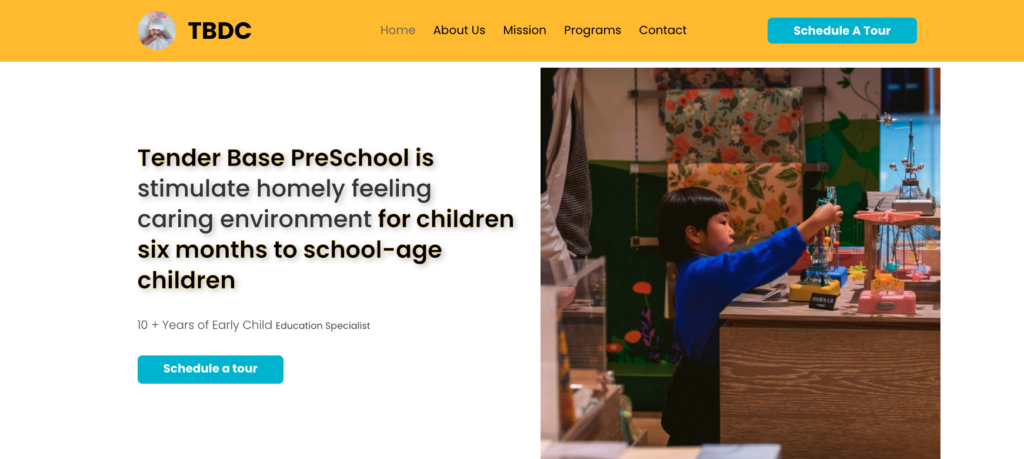
Objective
The client Shyam came to us with four main goals to build a conversation-focused website.
- To build Tender Base PreSchool UI to be more conversation focused.
- To have a better appointment booking rate.
- To have an overall good & meaningful design.
Solution
We had built a wireframe planned design update to increase conversation & signups. Designed a clean UI for the whole website to a modern conversion-focused look. We choose colors such as yellow which symbolizes happiness, hope, and spontaneity & blue which symbolizes trust
Custom Solution
- For User: We built one-click login appointment booking integration.
- For Admin: We built a dashboard to manage users, contact, and everything needed to keep a bird’s eye view on the website for smooth working.
UI Design
Previous slide
Next slide
Final Website
Previous slide
Next slide
Design Planning
We had built a Figma Designs and planned design updates to increase conversation & signups. Choose a clean UI design & revamp the whole website to a modern conversion-focused look.
Testimonial
Both Amit and Diwakar have helped me to make my little dream into reality. Thanks a lot for completing my Tolet App. It was nice working with you guys.

Amit Chaudhary
Owner, ToLet


